Poster Presentation Guidelines and Information
Posters will be judged Wed. beginning at noon. To be judged, you must have your poster up by that time. Online posters will be judged online and onsite posters will be judged on onsite. If you would like your poster archived in the VSU collection, please send copy in an email.
Poster Requirements:
- The maximum poster-board surface area is 4’x3’ (4 foot by 3 foot). You will place your poster on a board and tripod provided on the day designated for you to set up your poster. The board can be oriented either horizontally (4’ wide x 3’ tall) or vertically (3’ wide x 4’tall) on the tripod. So, if PowerPoint is used to create the poster, the “page set-up” can be in landscape mode 48”x36’’ (48 inches x 36 inches) or in portrait mode 36”x48” (36 inches x 48 inches). Posters can be smaller if desired.
- Two-sided tape poster will be provided for poster mounting.
- Limited number of tables (on request) are available for presenters that like to use additional materials such a laptop, samples, lab notebooks, handouts, etc. during the poster presentation.
- A poster must be related to the research materials covered in the submitted abstract.
- Posters can be printed at the VSU New Media Services located in Odum Library. The Undergraduate Research Council will cover the cost of the printing done at Media Services. Note that it will be fine if Media services prints your poster smaller than the dimensions given above (e.g., smaller than 48”x36”). Lamination cannot be done on posters that are 3' x 4' unless they are cut in half. Lamination is not required on posters.
- Posters will be judged and monetary awards are given to the best posters in various fields.
For additional information about the poster presentations at the VSU Undergraduate Research Symposium please contact Dr. Lavonna Lovern at llovern@valdosta.edu.
Poster Design Video Discussion
Poster Design Tips
The following tips/suggestions have been prepared to help improve the effectiveness of poster communication:
- You have complete freedom in displaying your research materials in various forms of text, figures, charts, schematics, and photographs. However, the text/graphs must be readable/visible from 6 feet (2 meters) away.
- The poster should provide enough materials to explain the research without an oral presentation. The materials should stimulate discussion and initiate questions.
- Poster sections should include an abstract and/or methodology/research question (depending on your discipline), results, discussion, and conclusions.
- In general, posters are read from left to right and from top to bottom.
- Make an initial rough layout, keeping in mind proportions of figures, tables and text. Text should cover less than 40% of the poster area.
- You can use different font sizes and colors to draw attention. For example, one can use the font types of “Helvetica” for headers and “Times” of the main text of the poster.
- Use high resolution photographs.
- Avoid overwhelming viewers with too much information.
- Be clear and concise in all statements.
Print your poster at least two days before the symposium.
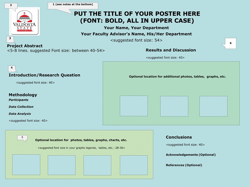
The following is an example of an acceptable poster layout:
(For additional info about each section, please read the notes at the bottom of the poster)

Notes:
- Title should be in an easy to read font, such as Verdana, font size should be 80, bold type, written in all upper case. Please do not change your title after you have submitted your abstract.
- Instead of the VSU Logo, a picture of the author(s) can be placed here.
- The abstract should be the same abstract that you submitted in your proposal and is in the Symposium Program.
- You are not limited to the section headings shown on this template and can use other section titles that are appropriate for your research. Change section subheadings as appropriate for your research.
- You can use as many high resolution pictures, tables, or graphs that you like and can place them anywhere on your poster with an appropriate margin. However, the font size used on the graphs, pictures or tables should be at least 28, so that all words and numbers are still readable after the poster is printed on an 8.5 X 11 sheet of paper. Figures and tables should have numbers and legends.
- You can use any background color that you like for your poster. It is suggested that you use simple background to avoid distraction. Dark colors on white background or bright colors on white background make it easier to read your poster.
Undergraduate Research Council
-
Ashley Hall
Room 1217 -
Mailing Address
1500 N. Patterson St.
Valdosta, GA 31698 - Phone: 229.333.7376